

Designing
Case Study

Project overview
This project aims to design a seamless, user-friendly financial app that
simplifies money transfers and makes financial information clear and
accessible. The focus is on enhancing user satisfaction, engagement,
and retention by addressing pain points like complex transactions and
cluttered data.
Challenges
In designing an intuitive financial app for young,
digital-native users, we encountered several key
challenges that needed to be addressed in order
to create an effective and user-friendly
experience.

1
Smooth Transfer
Experience
Young users expect fast, intuitive transfers. The current process is too complicated and cluttered, causing confusion andpotential drop-offs.
2
Clarity of financial Information
Young users want clear, digestible info, but the current design is cluttered and hard to read. Improving the layout and visual hierarchy is key to making financial data easier to understand.
3
UI and Brand
Consistency
Digitally native users prefer sleek, consistent interfaces. It’s crucial to maintain visual style while ensuring the app’s branding resonates with this demographic.
Used Methods
We conducted competitor analysis to identify best practices and user testing to observe behaviors and gather feedback. Additionally, we redesigned the information hierarchy to enhance clarity and improve the visibility of key financial data.

Solutions
Designing an intuitive and engaging financial app for young,
digitally native users presents unique challenges. These
include simplifying the transfer process, improving data
readability, and ensuring a consistent and visually appealing
user interface.

Smooth Transfer Experience:
Young users expect quick and intuitive transfers, but the current process is overly complex and cluttered, leading to confusion and potential drop-offs..
Clarity of Financial Information:
Young users prefer clear, digestible data, yet the existing design is hard to read and visually overwhelming. A more organized layout and improved visual hierarchy are essential for better comprehension.
UI Brand Consistency:
Digitally native users demand sleek, consistent interfaces. Maintaining a cohesive visual style and ensuring the app’s branding aligns with their preferences is crucial to engage this audience.
Road Map

Wireframes
The wireframes focused on mapping key user flows, such as transfers and viewing financial data. These low-fidelity designs helped refine the app’s structure and layout, ensuring a seamless user experience before finalizing the high-fidelity design.


Final Design
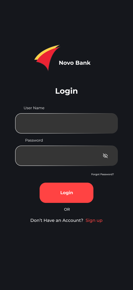
We revamped the existing interface to simplify user flows and improve clarity, focusing on reducing visual clutter. Key elements like transfers and financial data were reorganized for better accessibility and ease of use.
Home Page
I’ve designed the analysis page to present financial data in a clear, visually engaging format, with easy-to-read charts and categorized spending insights. This update allows users to quickly understand their financial health and track their spending habits with just a glance.

Analysis Page
I’ve designed the analysis page to present financial data in a clear, visually engaging format, with easy-to-read charts and categorized spending insights. This update allows users to quickly understand their financial health and track their spending habits with just a glance.

Transaction Page
The analysis page was designed to present financial data in a clear, visually engaging format, with easy-to-read charts and categorized spending insights. This update allows users to quickly understand their financial health and track their spending habits with just a glance.

Add Money Page
The “Add Money” page was designed for a more seamless and intuitive experience, simplifying the process of adding funds with fewer steps. Clear options, a clean layout, and progress indicators ensure users can quickly and confidently fund their account without confusion.

Chat Page
The chat page was designed to offer a more user-friendly and responsive experience, with a streamlined interface for easy communication. Clear conversation threads, quick reply options, and intuitive controls ensure users can get support or connect with others effortlessly.

Final Design
The final design brings a cohesive, user-friendly experience with intuitive navigation across all pages, ensuring tasks like transfers, viewing financial data, and managing transactions are quick and effortless. With a modern, visually appealing interface, the app delivers both functionality and an engaging user experience tailored to the needs of digital-native users.


Summary
This project focused on redesigning a financial app to meet the needs of young, digital-native users who value seamless, intuitive experiences. By addressing common pain points such as complex transactions and unclear financial data, we created a streamlined interface that simplifies tasks like transferring money, viewing spending insights, and managing transactions. Key updates included a cleaner home page, clearer financial analysis, simplified transaction flow, and a more intuitive “Add Money” feature. The final design ensures users can complete tasks quickly and easily, with a modern, visually engaging interface that enhances user satisfaction, engagement, and retention.
